How to display content in multiple columns using CSS
Break content into multiple columns using orphans or widows property in CSS

I am a Front end developer currently working on React JS, HTML, CSS, Python, Vue JS, Webpack, Babel, AEM etc.
In this article, we are going to see how or when orphans or widows property in CSS can be used in showing content as multiple columns.
[P.S : Refer the codepen given below to see visually how each property behaves]
Consider that you have a list of paragraphs and you want to show it in 3 or 4 columns and also decide where or how the content can break. Let's see the first step on how you can split the content in a simple way.
Simple steps on how to show content into multiple columns.
- Create a div with multiple paragraph tags or a ul with multiple li tags
- Add the below code snippet
columns: 3 // should be a positive integer. Here the paragraph will be split into 3 columns.
.split-3-columns {
  display: block;
  columns: 3; // value based on how many columns you want the content to split
  height: 250px; // height of the div as per your need
}
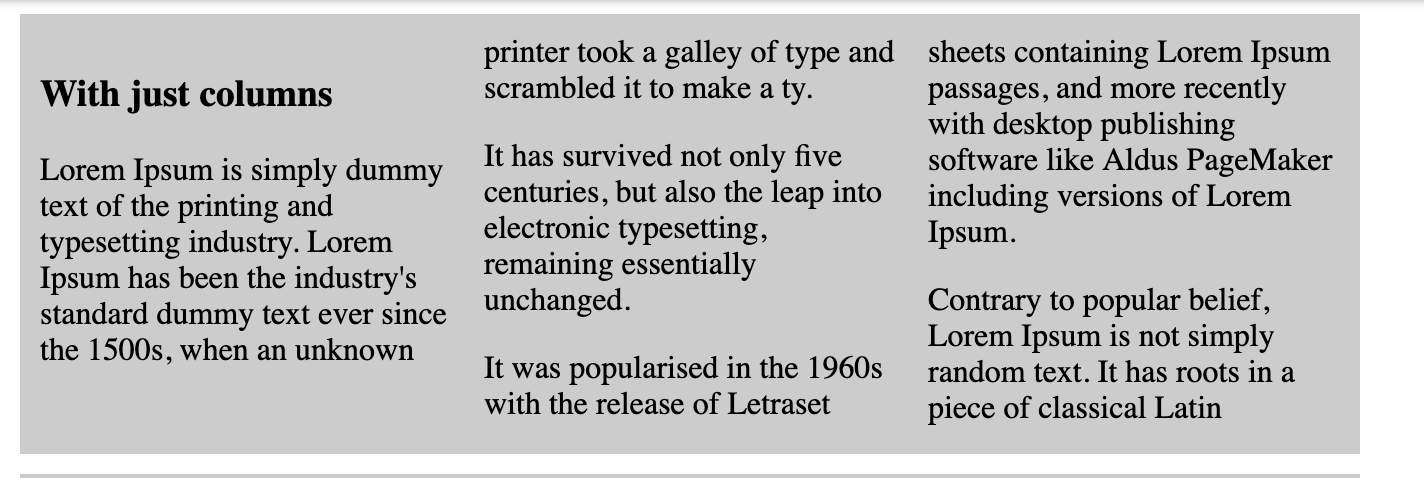
In the above example, columns property accepts a positive integer value.Eg: value 3 means, the paragraphs will be split into 3 columns in the browser. When the content is split into multiple columns at times the layout or the paragraph might not look as expected.
Eg: You might end up seeing something below, where in the second column, the column begins with the last line of the paragraph and seeing it in just two line looks weird. In this case you might wish that when the content does break you might want to show the last three lines of a paragraph at the start of the column instead of just two lines. This is where widows come into the picture. The same goes for the paragraph for "It was popularised..." the first lines of the paragraph at the bottom of the column is in 2 lines, but you want to change how many lines of a paragraph are shown at the bottom of the column, this can be done using orphans.
Orphans
The orphans property sets the minimum number of lines that can stay by themselves at the bottom of a fragment(columns) before a fragmentation(column) break. The value must be positive and applies to block level container elements. This value typically affects the first line of the paragraph
- In the below codepen example , orphan value has been set to 1. Hence if you check the paragraph "It was popularised in the 1960s", it breaks as a single line i.e if the paragraph at the bottom of the column is expected to break at the first few lines then it will make sure that atleast 1 line of paragraph is seen at the bottom of the column(fragment), if there is no enough space to break based on the orphan value then it will rather start in the next column.
.split-3-columns {
  display: block;
  orphans: 1;
  columns: 3; // value based on how many columns you want the content to split
  height: 250px; // height of the div as per your need
}
Widows
The widow property sets the minimum number of lines that can stay by themselves at the top of a new fragment(column) after a fragmentation(column) break. The value must be positive and applies to block level container elements. This value is typically for the last line of a paragraph
- In the below codepen example , widows value has been set to 5. Hence if you check the paragraph "Lorem Ipsum is simply dummy " you would see atleast there are 5 lines of text from the end of the parapgraph is shown at the top of the second new column/fragment.
.split-3-columns {
  display: block;
  widows: 5;
  columns: 3; // value based on how many columns you want the content to split
  height: 250px; // height of the div as per your need
}
Browser support:
This is supported in all major browsers except for firefox in desktop and android firefox in mobile. For more details refer the MDN docs given below in the references section.
References
Lets connect on Twitter | LinkedIn for more web development related chats.